a style for a brand of the future — from scratch
Brand identity, packaging, catalogue and photo shoot for a new cosmetics brand — from the first meeting to a finished product line on the shelf.
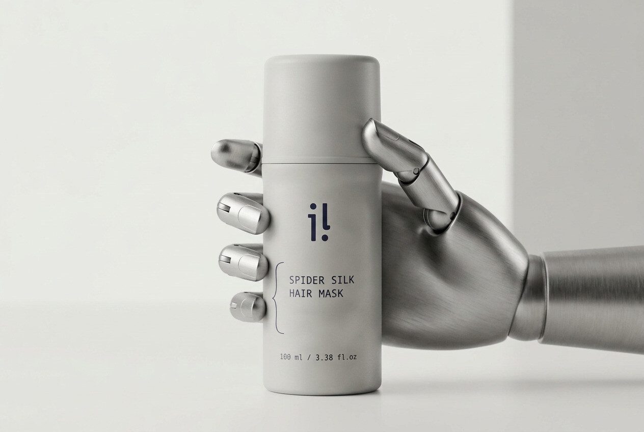
a brand identity from scratch
The client found me through Google. We met, discussed working together — and started with the brand identity and visual concept. The idea: a high-tech, unisex product about the future and innovation in cosmetology — not tied to any one gender or age.
Everything had to be thought through from scratch while constantly keeping the main condition in mind — unisex. Any feminine solutions that naturally suggested themselves had to be cut, and I had to explain to the client why that wasn’t our path. At the same time, I wanted to keep a connection with Latvia, where the brand comes from.
That’s how the Iluris logo came about, along with a restrained, high-tech palette in grey tones, a font pairing and the brand’s core visual system.
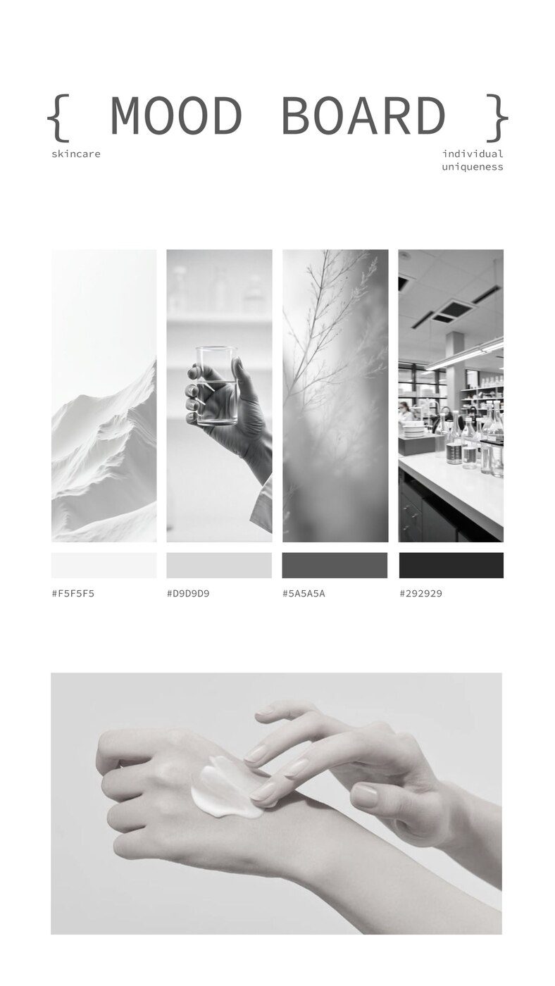
moodboard and palette
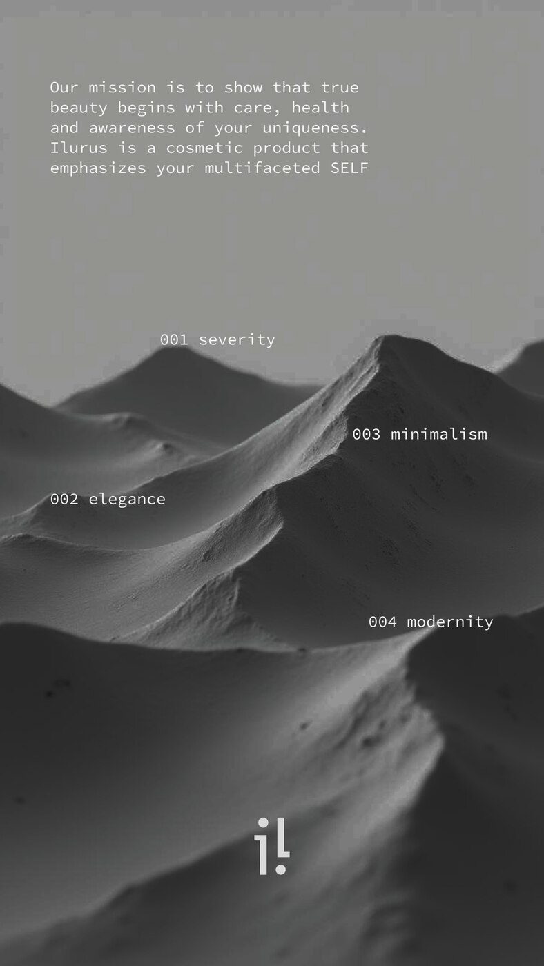
brand mission
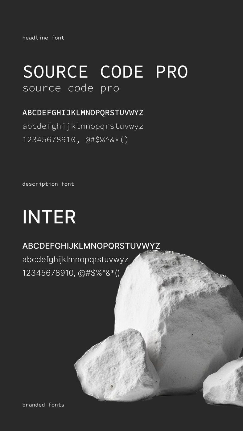
brand fonts
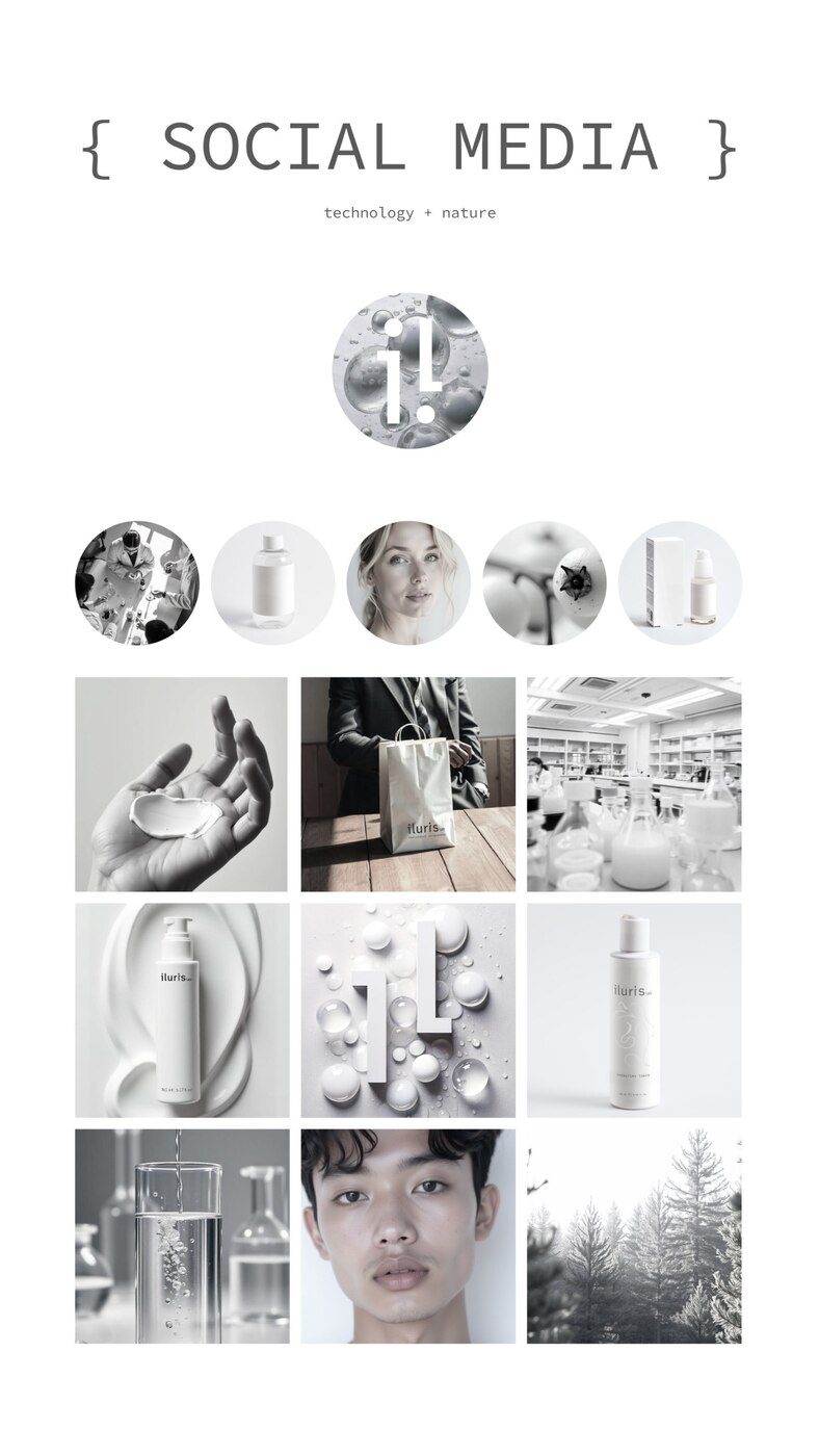
social media guide
photo shoot
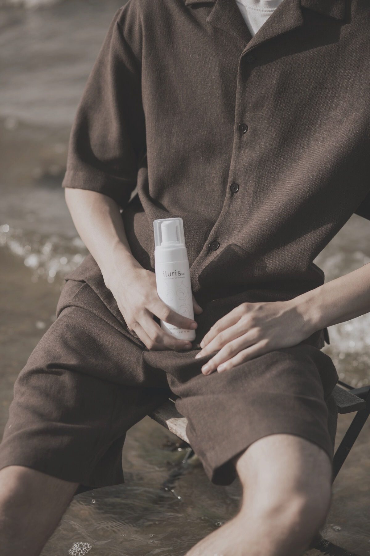
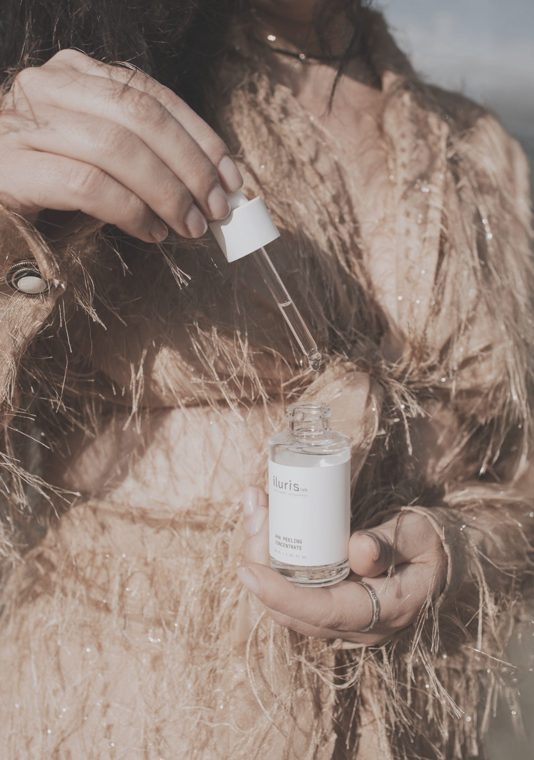
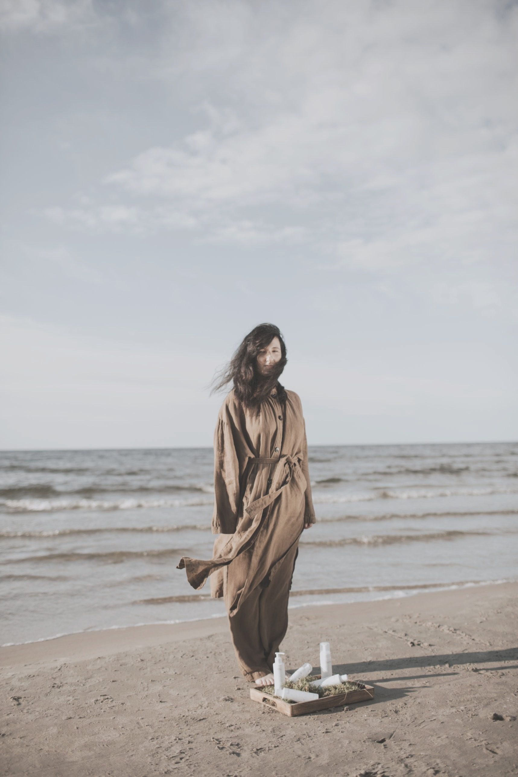
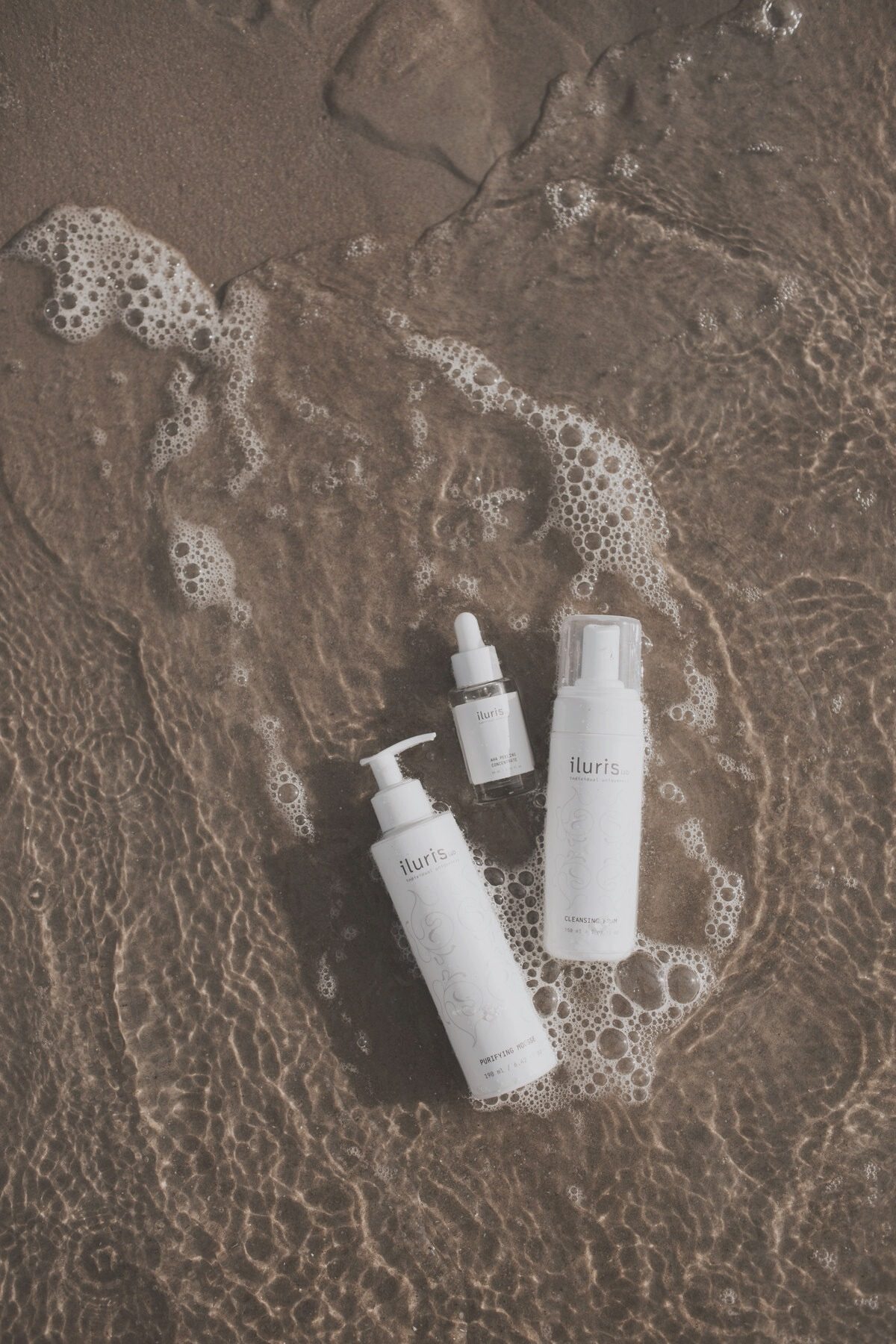
I was in charge of organising the photo shoot — I found the location, brought in a stylist and a photographer, invited a drone operator, and on set I was both organiser and assistant. The goal was to show Latvia’s nature and the product within it, as well as different people — of different ages, men and women. One of my favourite finds: a mother and son in the frame — showing that Iluris Lab works for any gender and age.


product catalogue and booklet
Next, the client ordered a product catalogue — bringing the whole line together in a single visual presentation in the brand’s style. In parallel we made an information booklet — with ingredients, directions for use and product recommendations by skin type.
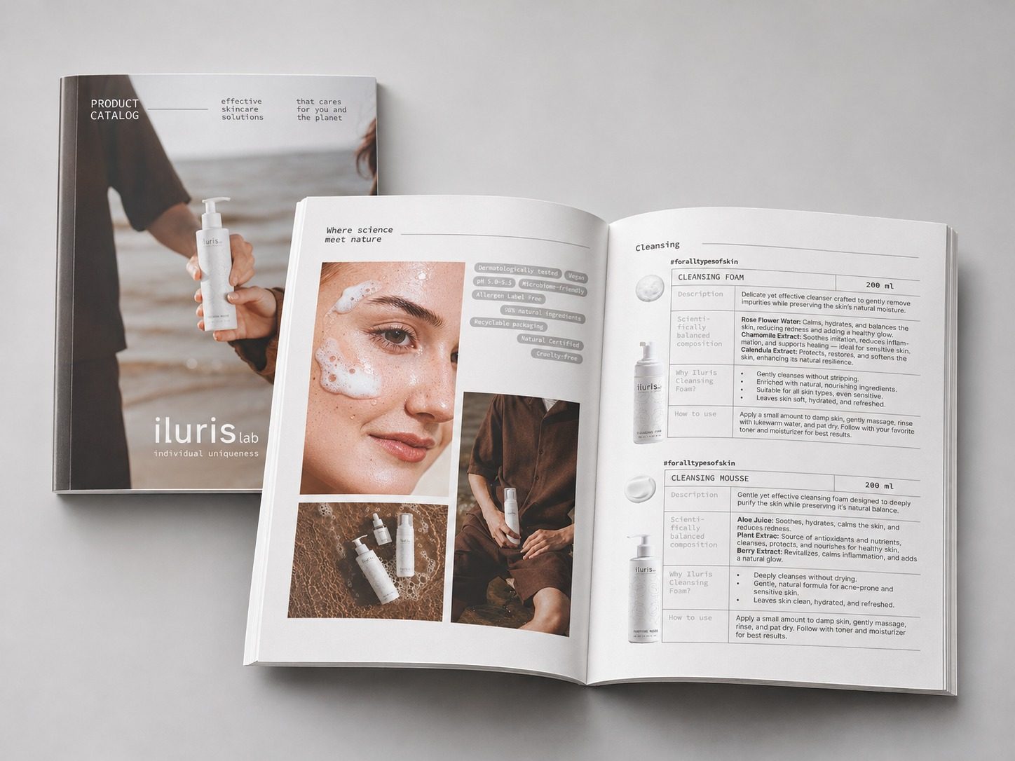
catalogue: cover and spread
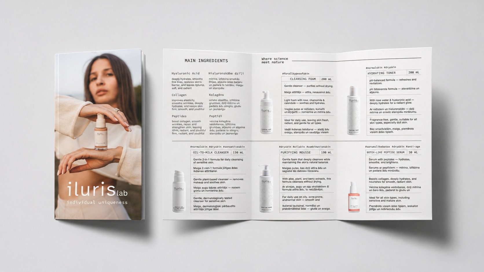
booklet: cover and spread
label design
When the cosmetics line launched, I designed labels for each product — in the same high-tech, restrained logic as the brand identity.
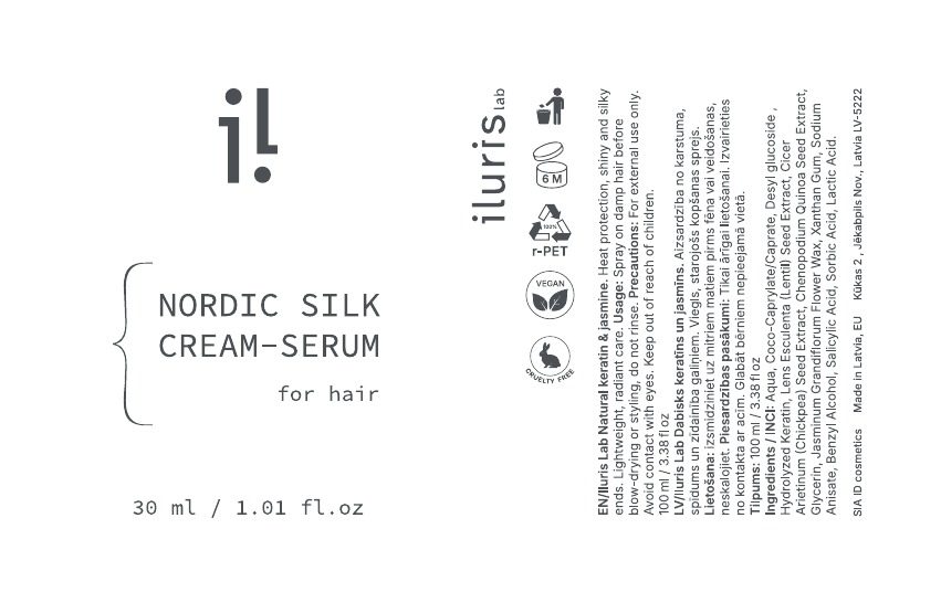
label layout
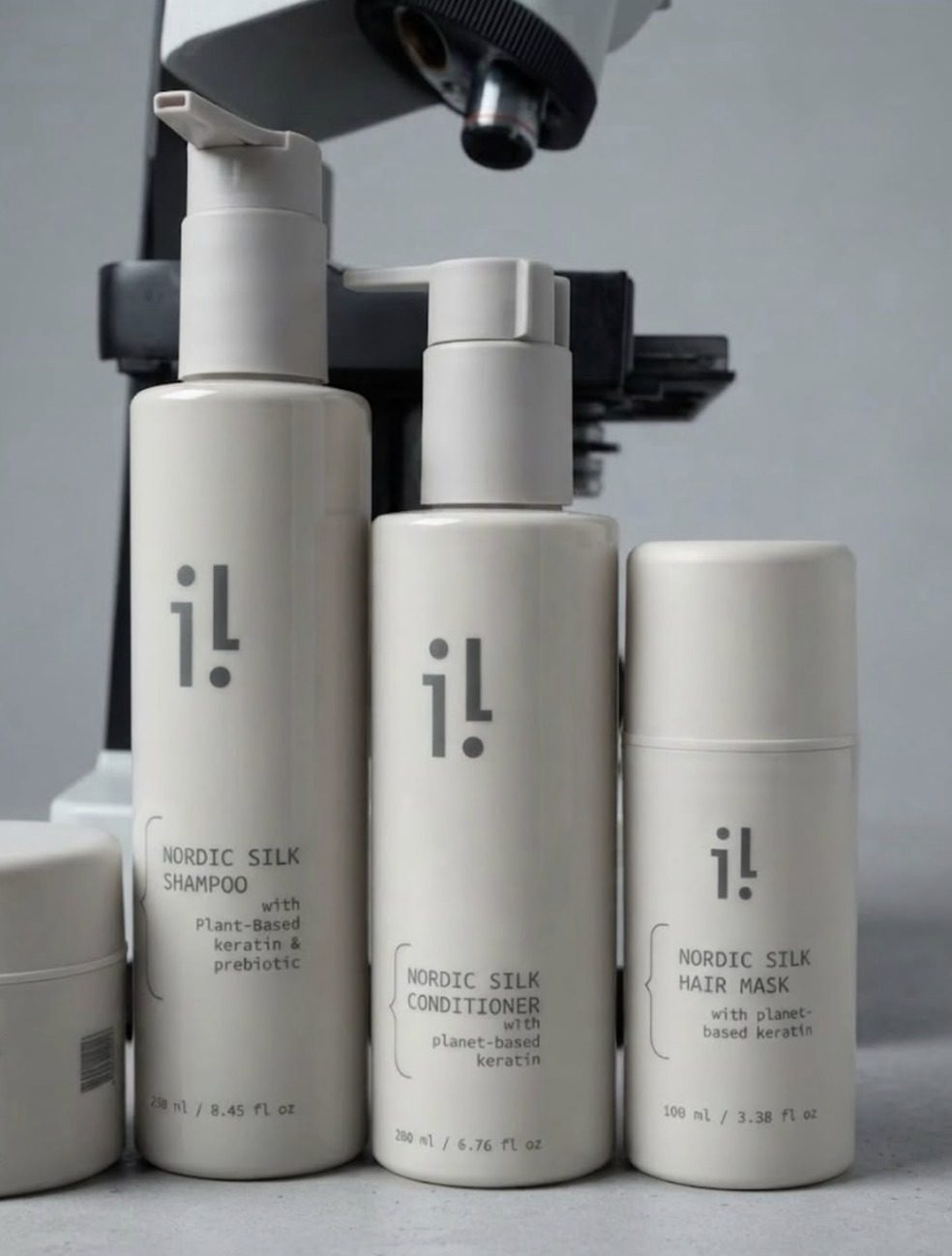
products
approach
The key was not to lose the concept along the way — to stay on course with the high-tech, unisex idea at every stage, from logo to label, without losing the brand’s connection to Latvia. The result is a cohesive visual system in which the catalogue, packaging and photography speak one language.
want a result like this for your brand?
Tell me about your project — I’ll reply and suggest where to start.
discuss a project